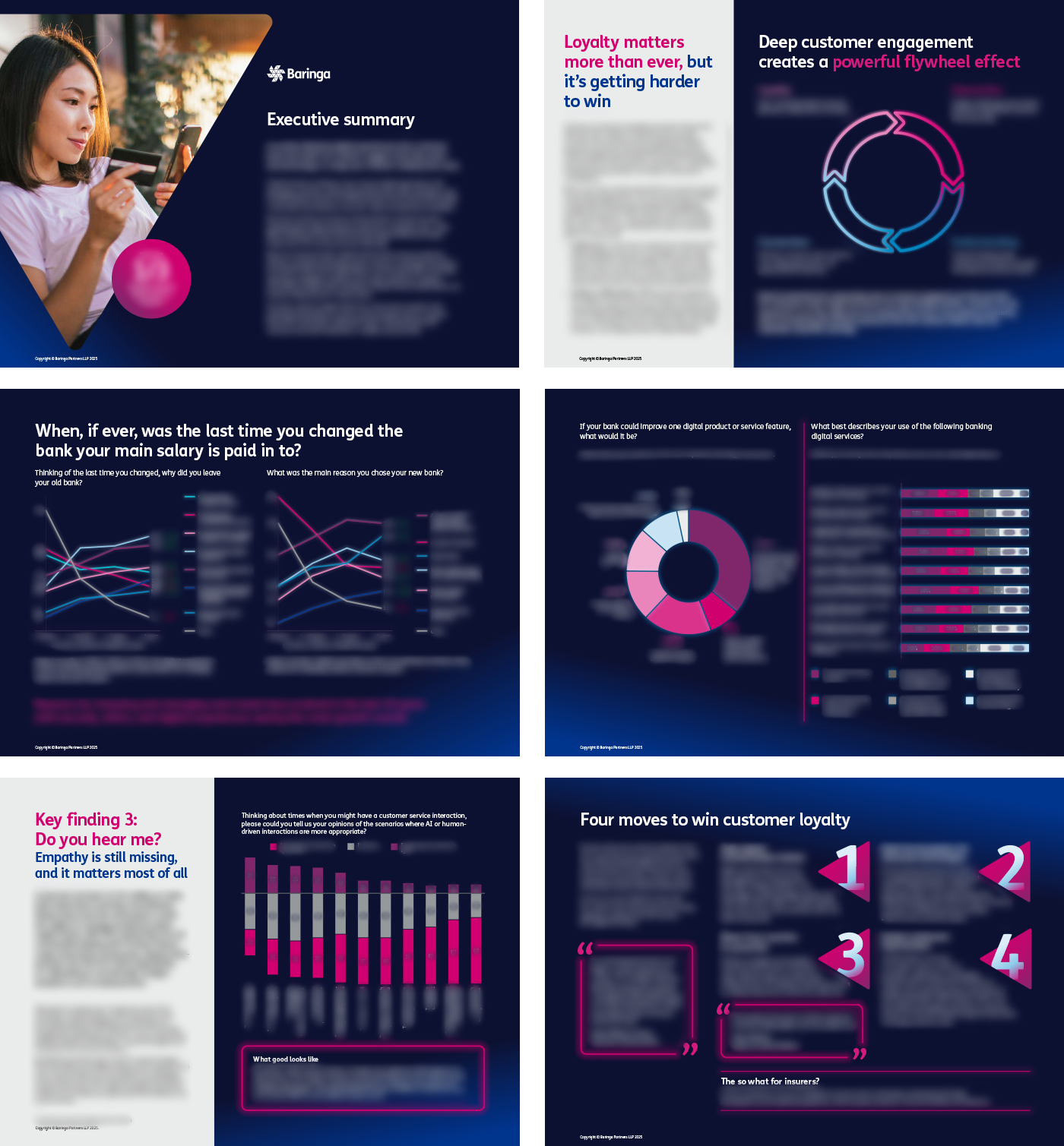
Baringa’s asked us to design a retail banking report with a refreshed digital/mobile banking look. This was challenging from the very start, it was our first brief since OLIVER acquired Baringa and it wasn't to follow their standard brand guidelines but instead a 'loose' visual guide towards their Digital and AI section along with a brief that was more notes than a fully written brief. A summary was a stylish and professional looking report that avoided a stuffy look, that would stand out from their competitors Accenture, Deloitte and RWS.
The outcome for their Baringa retail banking survey is I delivered a contemporary, professional identity that felt playful without being overly formal – exactly the balance Baringa requested. The report and visuals differentiated Baringa from larger consultancies and provided a practical foundation which continues to be implemented into their current Digital and AI reports.
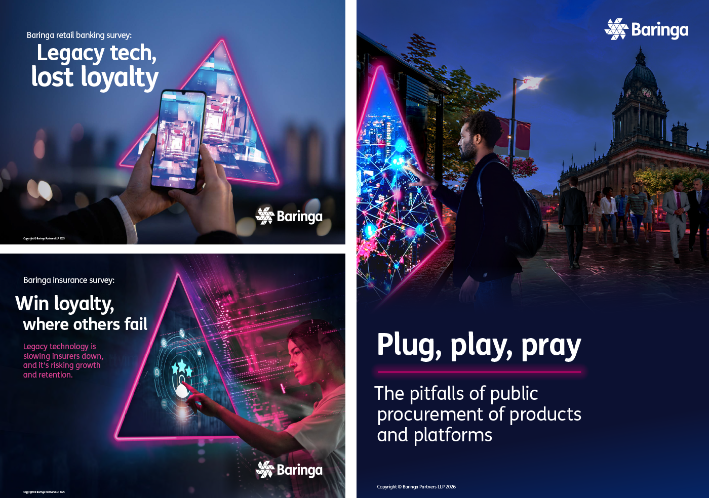
The journey towards creating the first report was not smooth sailing but had a silver lining. With the limited direction and no existing visual guide, this was an opportunity to help Baringa establish a new identity for their Digital and AI section which would develop alongside their investment into AI.
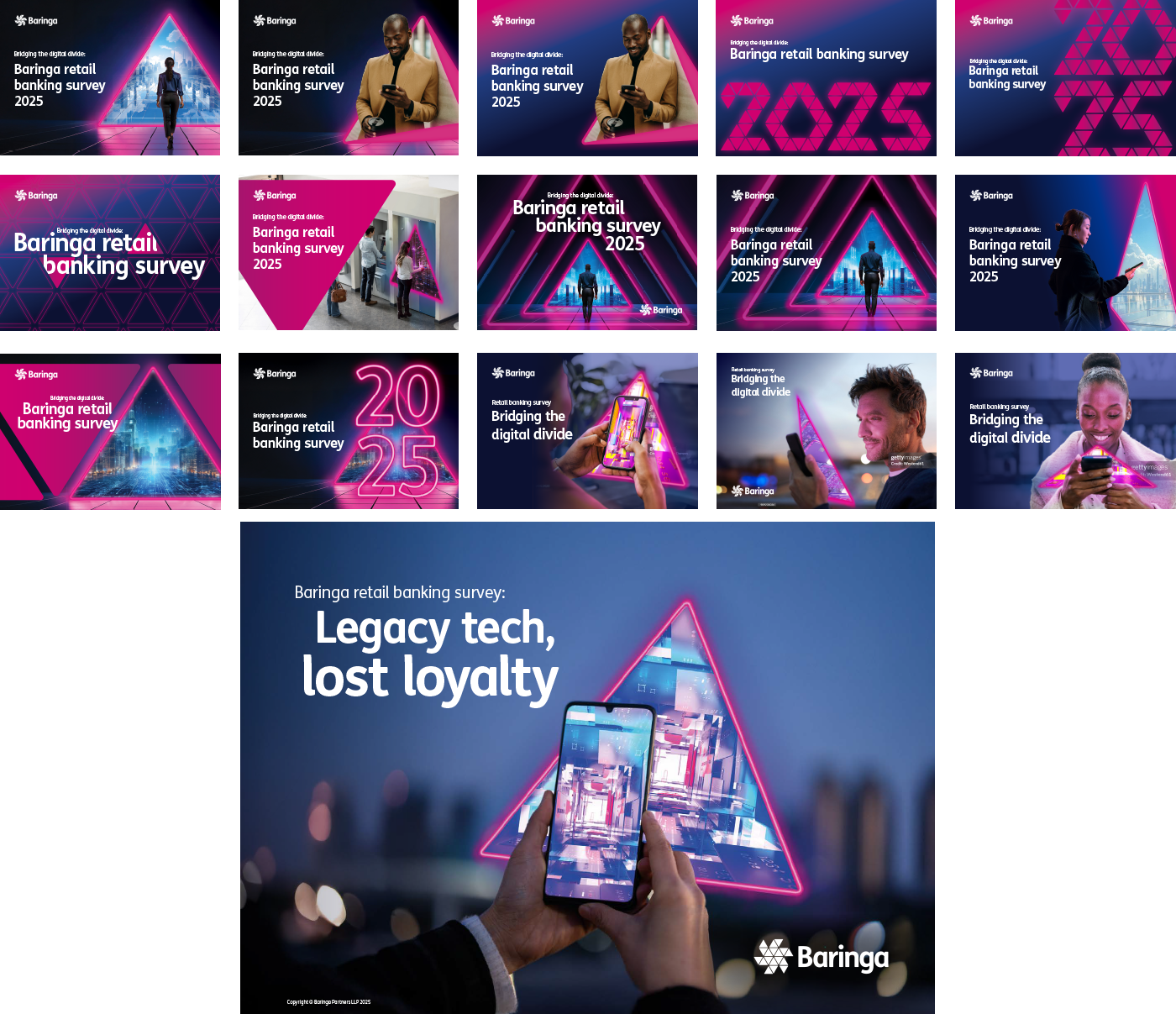
A strong point to their branding is the triangle, which is seen as a 'portal' or 'window' to guide their clients towards building a successful business. They initially asked for an image or stand out graphic to pull readers in, going through revisions I got a better understanding of the Baringa's triangle in their brand positioning along with constructive feedback from the client to produce the front cover outcome below.
Once the front cover was signed off, elevating the layout from their old brand reports was crucial so the content really stood out – especially if the large amounts of data supplied looked dull. Continuing with the neon colour theme helps the graphs appear more energised and futuristic to go with the digital banking feel.